I'm one of the few people living in New York City who actually enjoys taking the train. If I need a mojo recharge, I jump on the train. There's no denying there's a special vibe going on underground (and above). It's really fascinating to me that you can walk down a staircase, go underneath the street, and there's a vast world that connects the entire city. It's like a whole other place with it's own code of ethics...written and unwritten.
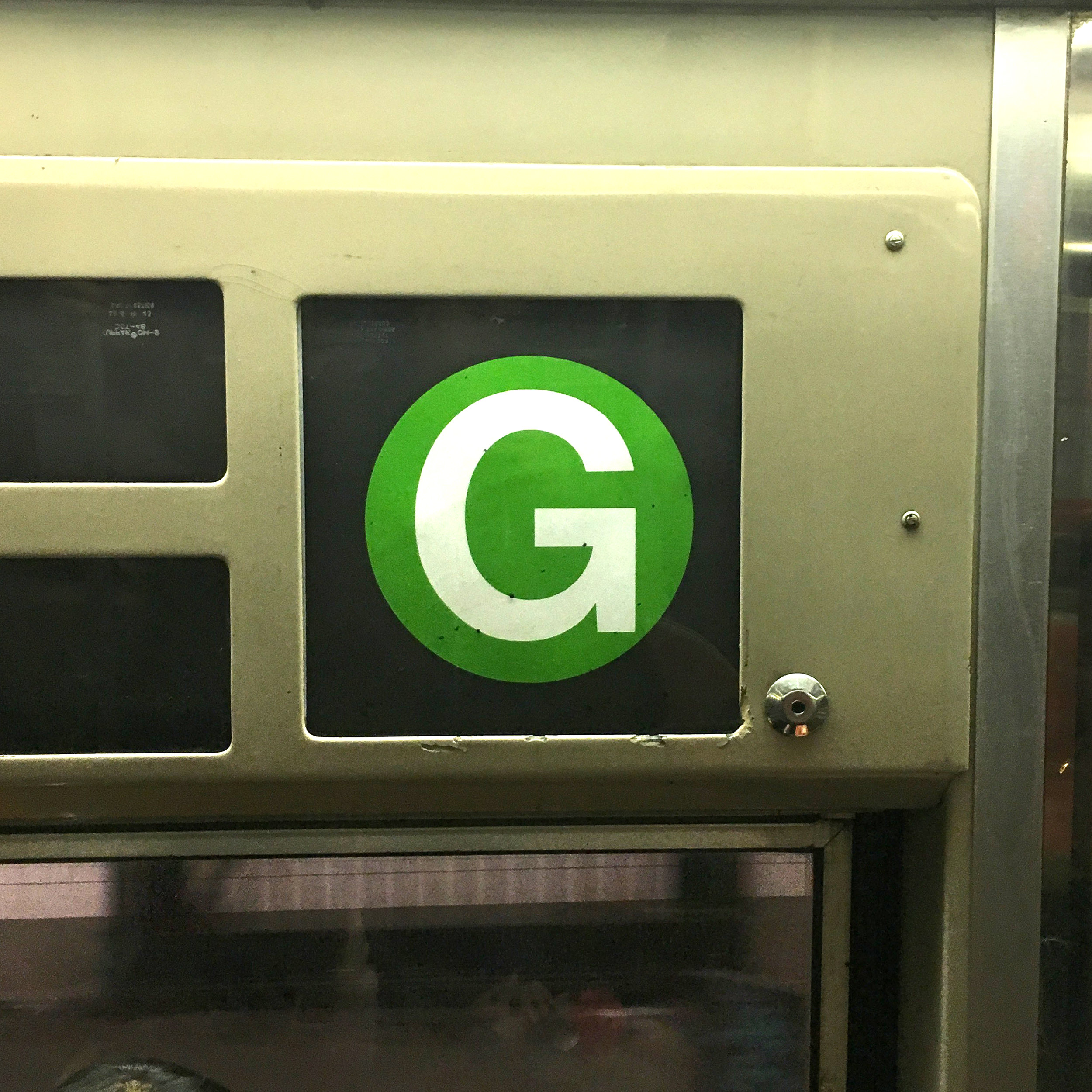
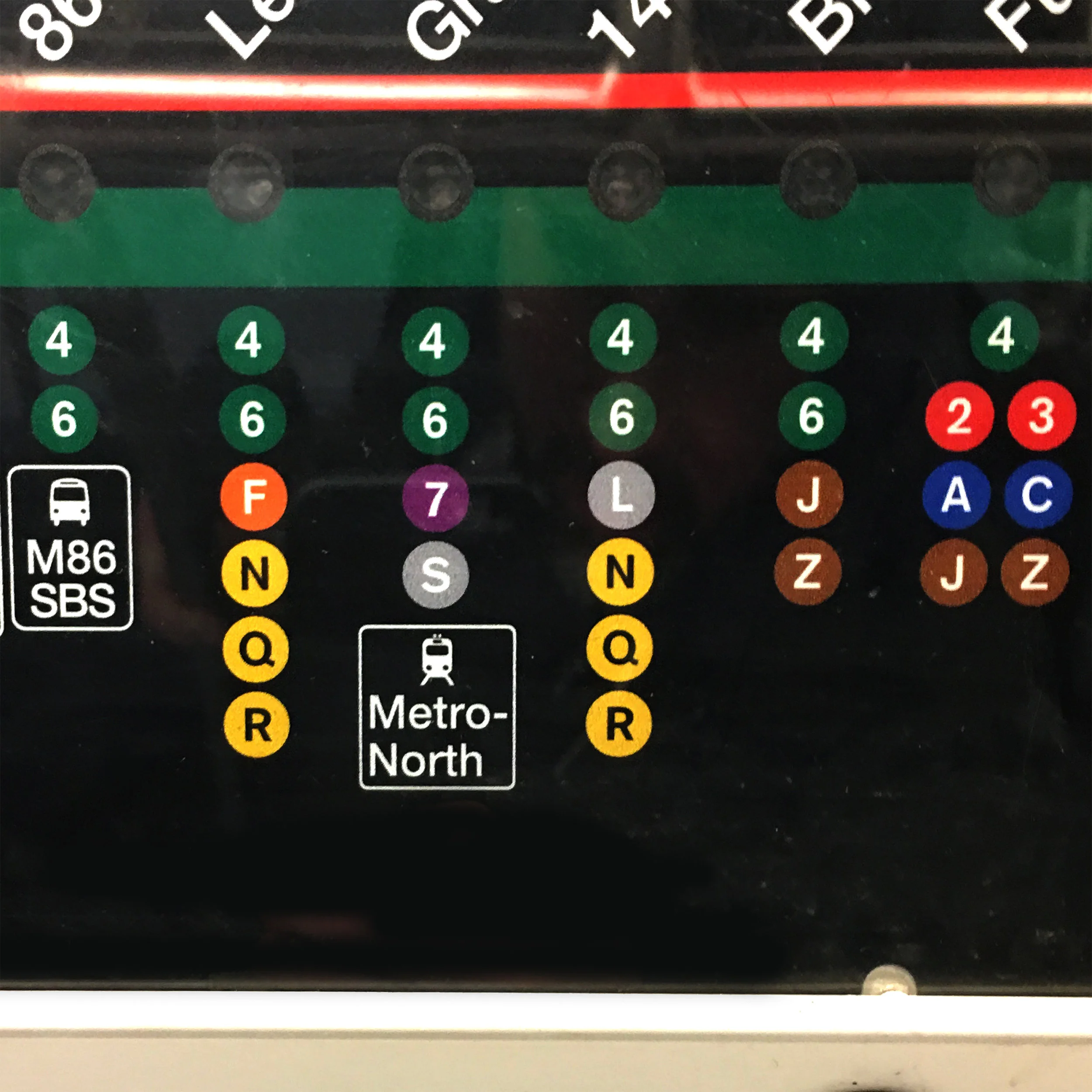
In this "Home" series, I'm trying to create an aesthetic for each of the three films using a particular shape. For "Caverns" it was the obvious choice (to me) to use circles. Amidst a sea of straight lines (tile squares, rails, tracks, steel beams, platform tiles, stairs, etc.), the bright colored circles that appear against black signage seem really prominent.
Some examples:
I thought it was important for the color palette to resemble the colors of each train line. Otherwise, it wouldn't be distinctly New York's train lines. I'm pretty sure every train line color is covered in these two pics:
To get a circle with some real texture, I just took some photos and video of one of my clamp lights during the shoot for the entire "Home" series. I had shot a bunch of textures all at once. Here's the main element I worked with for "Caverns":
Personally, I think the star of this film is the audio track. These were all real sounds I recorded on an iPhone 6 using the Voice Memos app. I rode around the city for a few hours on various trains in 3 different boroughs to collect all the sounds I needed.
For the speaker announcements, I held my phone up to the speakers inside the train cars and at each station platform:
I also recorded sounds of every train entering and exiting the station. I made sure to go to a station that has local trains stopping there as well as express trains flying by:
I wanted to cut the audio so it sounded like choppy bits of a subway ride experience. Like this:
And this:
I drew a very basic storyboard and used it as a guide for the audio edit. The order really couldn't be random. It needed to feel like you embarked on a ride and had a destination. Once again, my boards aren't pretty. As long as the story flows and the energy is there, the drawings don't need to be beautiful.
Here are some stills of the final result:


