The Bronx has a really bad stigma. When someone outside of New York thinks of The Bronx, typically it's gunshots, murder, fire, crack, bullet holes, knife fights, dirt, grime and poverty. And maybe the Yankees. Sure, The Bronx went through a bad time. But that doesn't mean that it's stereotype is the ONLY way it can be portrayed.
Considering the bad rap, it's still proud of itself. The obvious things: birth of hip-hop (and probably doo wop); championship baseball; toughness. And no matter what ANYBODY says, The Bronx has the best pizza. And bakeries. And delis.
It's a borough that's not afraid to get it's hands dirty. Matter of fact it's not afraid of anything. We'll die before we back down. And even though it's a mainly segregated place, there's something of a camaraderie. A brother and sisterhood. No matter what it's still HOME. To me, at least.
This film isn't offering a healing of the wounds. It's merely a portrait. Small bits of things pieced together to create a mosaic of The Boogie Down. After making this film I was reminded that The Bronx wears it's scars pretty well. And the people wear their scratches like a badge.
-----------------------------------------------------------------------------------------------------------------------
Much like the other two films in this micro-series, I used a scratch texture I created...from scratch. For more of an explanation on that, click HERE.
For "The Boogie", I had my clamp light on a dimmer and pointed it up through the glass table/green cellophane/scratched acetate. Then I just randomly played with the dimmer and used this footage as a background plate. Here's the raw footage of what I mean:
It yielded some really nice results. I wanted it to feel like summer and this footage definitely added some "heat":
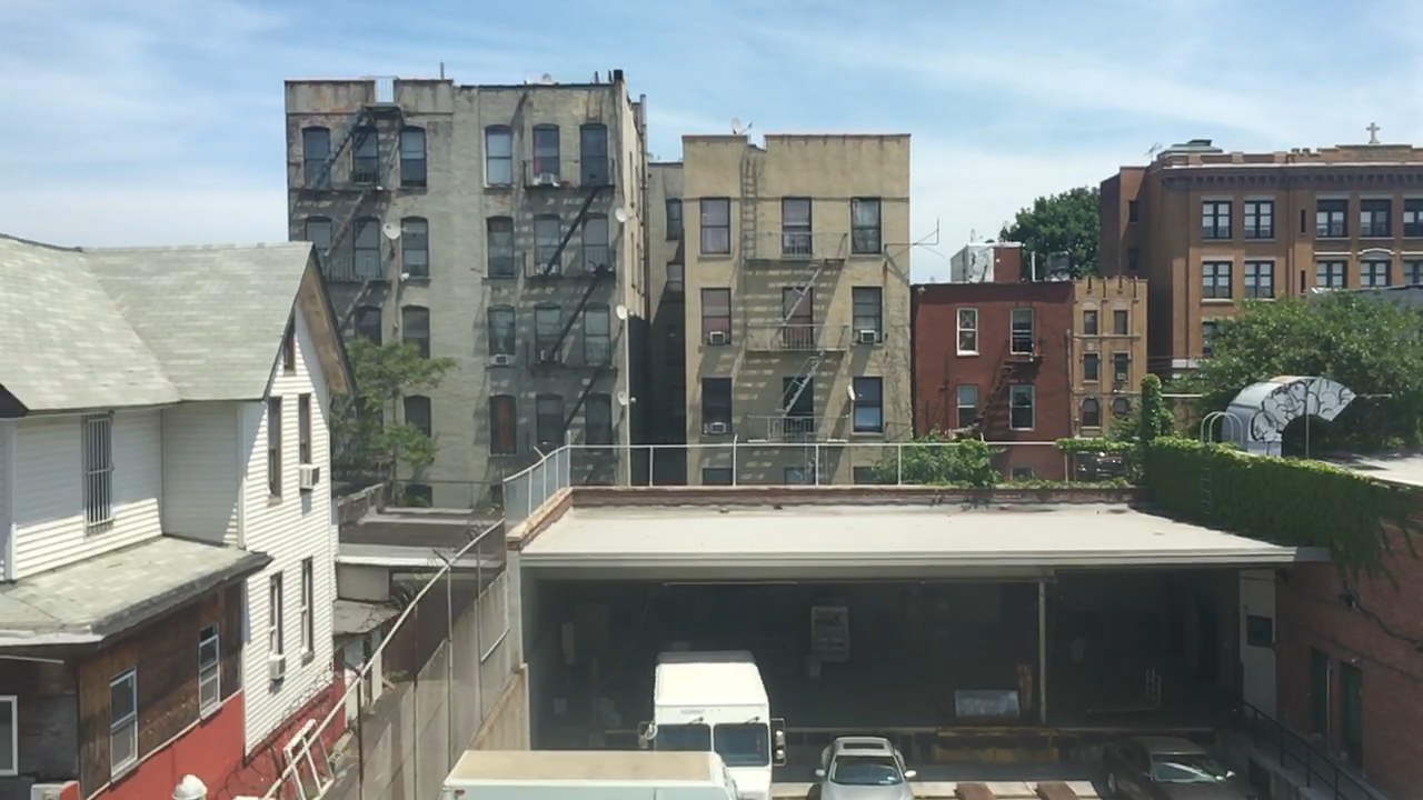
The building shots were taken in the South Bronx where the elevated train passes through. I took slow motion footage on an iPhone 6. Some raw stills from the footage below:
I did a little stop motion animation for the vinyl record bit:
I also did a bunch of very crude hand drawn animations with a ball-point pen. I used a technique called "straight ahead animation" and the way I went about it was REALLY down and dirty. I used my phone as a lightbox (mad guerrilla) and drew really small drawings. It was a fast and cheap way to do what I wanted but I wouldn't recommend it if you're a perfectionist. There's a lots of hoping and praying involved that it will work:
Here you can see these little pieces applied to the scene:
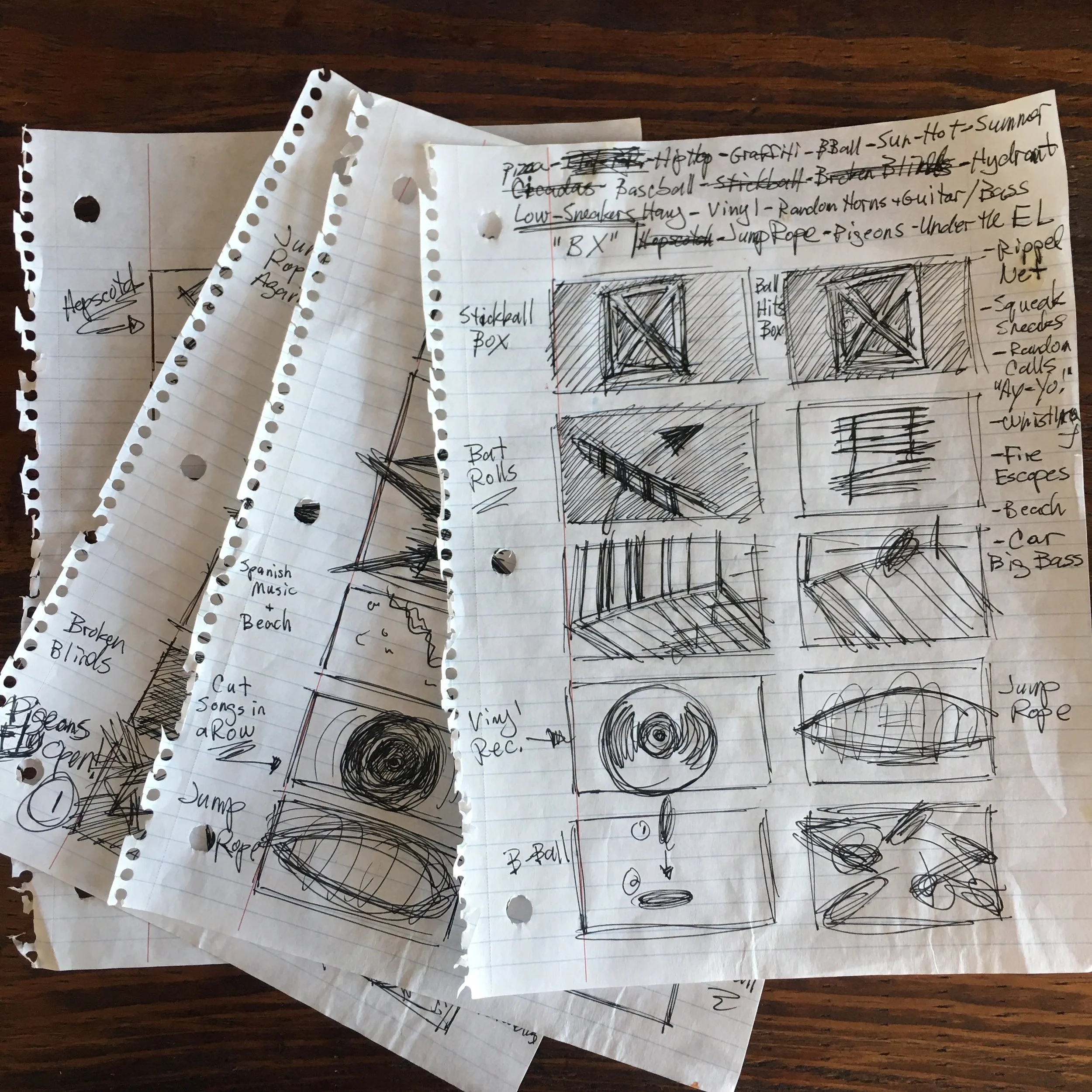
I've been shitting all over storyboards with this "HOME" series. And this film was the final shit. I really can't stress enough that pretty storyboards can be a giant waste of time. I hastily scribble through storyboards. About half way through production I got rid of them altogether:
Ripping up those boards was really freeing. This isn't a narrative. It's a portrait. Not having to worry about what shot went after another gave me tons of latitude in the edit. And I was able to paint a picture and present some kind of feeling while being mindful of the sense of place.
Simply put, I winged it. And it felt really good to do that. Filmmaking can be really structured and confining if you're not careful. By the time you get to the edit, you can be very hesitant to try a different arrangement of shots and scenes because that's not the way you planned it in the beginning. A film is a journey and an evolution. And the act of making a film is no exception. So, if the end result might not be exactly what you originally pictured but the feeling that was intended is holding true, what's really wrong with making it up as you go along?
This film might not be the best of the bunch in the end but it definitely opened a door to a new approach.


